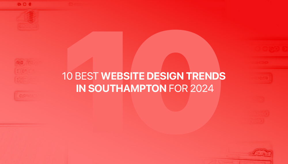
10 BEST WEBSITE DESIGN TRENDS IN SOUTHAMPTON FOR 2024
From eye-catching visuals to easy-to-use navigation, these trends will not only enhance the aesthetics of your website but also improve user experience. Whether you’re a small local business or a larger corporation, incorporating these trends into your website design can give you a significant edge against local competitors and national competitors.
So, what can you expect in 2024? We’ll go into the rise of bold and vibrant colours, the integration of interactive/animated elements, and the importance of mobile optimisation (more so than ever). We’ll also discuss the growing popularity of minimalistic designs and the use of animations to captivate your audience. Get ready to take your website to the next level with these awesome web design trends.
Quick Links:
- The Importance of Staying Updated with Design Trends
- User-Focused Design Approach
- Minimalist Design and White Space
- Dark Mode and Colour Trends
- Micro-interactions and Web Page Animations
- Mobile-First Design and Responsive Layouts
- Chatbots and Live Chat Features
- Bespoke Illustrations and Personal Visuals
- Implementing Website Design Trends in Southampton
- Conclusion
The Importance of Staying Updated with Design Trends
In the ever-evolving world of web design, staying updated with the latest trends and directions is very important. Design trends don’t just reflect the current aesthetic preferences but also address user needs and expectations from businesses. By taking advantage of the latest trends and incorporating them into your website, you can create a visually appealing and user-friendly experience that sets you apart from the competition within your industry.
One of the key reasons to stay updated with design trends is to maximise user engagement. Users are more likely to spend time and money on a website that looks modern and visually appealing. By including new design trends, you can capture their attention and keep them engaged, reducing bounce rates and increasing conversions.
Furthermore, design trends are often influenced by tech advancements and user behaviours. For example, now that we’re all using mobile phones more than computers, this evolution has led to the importance of mobile optimisation in web design. By staying updated with design trends, you can ensure your website is compatible with current devices, providing a seamless user experience no matter who’s browsing.
User-Focused Design Approach
2024 is the year when user-focused design approaches will continue to dominate the web design world. User-focused design hones in on understanding the needs and preferences of the target audience and designing the website in alignment with who they are and what they favour. This approach ensures that the website is intuitive, easy to navigate, and provides a personalised experience for each user.
To implement a user-focused design approach, it’s essential to conduct thorough research on your users and target audience. This includes analysing user data, conducting surveys or studies, and understanding user behaviour on your website. By understanding your target audience, you can tailor the design elements, content, and functionality to meet their specific needs and expectations.
Furthermore, user-focused design also involves creating clear and easy-to-use navigation. Users should be able to find the information they need easily and quickly. This can be achieved through well-organised menus, custom search functionality, and clear call-to-action buttons. By prioritising user experience, you can create a website that keeps users engaged and encourages them to explore further with your business.
Minimalist Design and White Space
Minimalist design has been a popular trend in many aspects of design, but more so in web design in recent years. Minimalist web design is set to continue its dominance in 2024, focusing on simplicity, using clean lines, white space, and minimalistic elements. This creative design approach not only creates a unique and clean look but also improves the readability and usability of the website across all devices.
One of the key benefits of minimalist design is its ability to draw attention to the most important information on the website. By reducing clutter and unnecessary information, you can highlight the key messages, products, or services you want to amplify. This helps users understand what your website is about and encourages them to take the desired actions a lot quicker compared to a cluttered, confusing website.
In addition to clean lines and white space, minimalist design often incorporates bold typography and high-quality images. The use of large, clear fonts improves readability, while high-quality images add visual interest and reinforce your brand identity. By incorporating a minimalist design approach, you can create a website that is visually appealing, user-friendly, and timeless.
Dark Mode and Colour Trends
Dark mode has gained significant popularity in the last few years and can be found on both websites and apps. In fact, you can even change your phone to dark mode! Dark mode is expected to be a prominent website design trend in Southampton in 2024. Dark mode refers to a colour scheme that uses dark backgrounds with light-coloured text and elements. This design trend not only looks sleek and modern but also reduces eye strain and improves readability, especially in low-light conditions.
In addition to dark mode, bold and vibrant colours are also expected to be popular in 2024. Bright, eye-catching colours similar to the red we use across the ZENTA Digital website can help your website stand out and create a memorable visual impact. However, it’s important to use colours strategically and ensure they align with your brand identity. Colour schemes can enhance the overall aesthetics of your website and create a strong brand presence.
When implementing colour, it’s important to consider colour psychology and its impact on your users. Different colours result in different emotions and associations, so choose colours that resonate with your target audience and align with your brand values. By using colour strategically, you can create a visually appealing website that effectively communicates your brand message and comes across as trustworthy, reliable and easy to contact. Below we’ve created a colour wheel to help you with your colour selection process.
Micro-interactions and Web Page Animations
Micro-interactions and animations are powerful methods to capture your audience’s attention and enhance their experience on your website. Micro-interactions refer to small, subtle animations or visual feedback that provide users with instant feedback and make the website feel more interactive. From button hover effects to page loading screens, micro-interactions can add a touch of delight and engagement to your website, similar to video.
Animations, on the other hand, can be used to translate information in a more effective way, guide users, or create visual interest. Whether it’s a scrolling animation, a loading animation, or a background video, animations can make your website more alive and engaging. However, it’s important to use animations sparingly and ensure they enhance the user experience rather than distract or overwhelm users.
When incorporating micro-interactions and animations, it’s important to find an appropriate balance between aesthetics and performance. Overusing animations can slow down your website and negatively impact user experience. This is why it’s essential to optimise animations for speed and ensure they enhance the overall user flow and engagement as this will massively aid your website’s SEO strategy later down the line.
Mobile-First Design and Responsive Layouts
We previously discussed the rise of mobile phone use for website browsing, which is why mobile-first design and responsive layouts have become essential in web design. In 2024, this trend will continue to gain momentum as more users access websites through phones and tablets. According to Statistica, 58.03% of web searches in 2023 were from a mobile device. Mobile-first design involves designing the website for mobile first and then adapting it for larger screens.
Mobile first design approach ensures that your website is optimised for smaller screens, providing a seamless user experience on mobile devices (which nowadays are more popular than computers). This includes designing with touch-friendly elements, optimising loading times, and ensuring the content is easily readable on small screens. By prioritising mobile users, you can support a dominant part of the market and receive the benefits of being present across both formats.
Responsive layouts are another very important aspect of mobile-first design. Responsive design allows your website to adapt to different screen sizes and resolutions, allowing your visitors to view the content on your website effectively no matter what device or browser they’re using. Responsive layouts are essential for retaining users and reducing bounce rates, as users are more likely to leave a website that doesn’t display properly on their device.
Chatbots and Live Chat Features
Chatbots and live chat features are on the rise. I’m sure you visited a website within the past few days that had one. Integrating chatbot and live chat functionalities into your website can provide a competitive advantage. In fact, we use it on our website with a WhatsApp extension that allows visitors to message us directly. This approach allows web visitors to interact with your business instantly, making it more accessible and convenient. Chatbots, on the other hand, can provide instant assistance and answer commonly asked questions, even while you’re not actively responding.
Implementing chatbots and live chat features can improve user experience by providing quick and personalised responses to user inquiries, dramatically minimising wait time. This can save users time and effort, enhancing their overall satisfaction with your website. Additionally, chatbots and live chat features can also gather valuable user data and insights, which can be used to further improve your website and marketing strategies.
When implementing chatbots and live chat features, it’s important to find a balance between automation and human interaction. While automation can streamline processes and provide instant responses, human interaction is still valuable, especially for more detailed inquiries or personalised assistance. By finding the right balance, you can create a website that combines efficiency and personalisation, overall massively enhancing the user experience on your site.
Bespoke Illustrations and Personal Visuals
In 2024, custom illustrations and personal visuals will continue to be popular in website design. Custom illustrations add a personal touch to your website, helping you stand out from competitors who rely on stock photos or generic visuals. Custom illustrations can be customised to your brand identity, conveying your brand message and personality effectively.
Unique visuals, such as custom photography or videos, can also create a memorable and immersive experience for users. By showcasing your products, services, or team through high-quality visuals, you can establish trust and credibility with your target audience and industry. Unique visuals can also help you communicate ideas or processes in a uniquely visual way and make things a lot more easily understandable.
When including custom illustrations and unique visuals, it’s important to make sure they align with your overall brand strategy and personality. Consistency is key when creating a strong and cohesive brand presence. Therefore, it’s important to work with a professional designer or photographer who understands your brand vision and can create visuals that resonate with your target audience. This way, you can maximise your success across all platforms and material.
Implementing Website Design Trends in Southampton
Now that you’re familiar with the most in-demand website design trends in Southampton for 2024, it’s time to implement them into your website. Start by taking a detailed look at your current website design and identify areas for improvement. Consider how each trend aligns with your brand, target audience, and business goals.
Next, work with a professional web designer who has experience in implementing the latest design trends. They can help you create a visually appealing and user-friendly website that incorporates your business identity and message. Collaborate with the designer to ensure the design reflects your brand identity and effectively communicates your key messages.
Regularly monitor and analyse the performance of your website with tools like Google Analytics to determine the impact of the implemented design trends. User feedback, analytics data, and conversion rates can provide useful insights into the effectiveness of your website design. Continue to update and optimise your website design based on these insights to make sure it remains up-to-date and user-friendly as this will maximise your online success over time.
Conclusion
Overall, staying up-to-date with the latest website design trends is very important for businesses in Southampton in 2024. By including the 10 best website design trends, including user-centric design, minimalistic design, dark mode, micro-interactions, mobile-first design, chatbots, and unique visuals, you can create a visually appealing and user-friendly website that sets you apart from the competition within your industry.
Remember, the key to successful web design and development is to align the design trends with your brand identity, target audience, and business goals. By working with a professional web design agency and continuously monitoring the performance of your website, you can ensure your website remains relevant, engaging, and optimised for user experience and online success. Embrace these trends and take your website to the next level in 2024.
Here at ZENTA Digital, we’re all about maximising the success of businesses online. So if you’re interested in learning more about improving your business development, or future-proof your business as a whole, enter your contact details into the form below and we’ll be in touch about how we can help your business today.
Share this posts with your network:
MORE POSTS


READY TO GROW YOUR SOCIAL MEDIA?
Schedule a 15 minute introduction call with a member of our team, no obligations, this is just to understand your challenges and explore the best social media approach for you, your business and industry.